Flexbox Cheat Sheet
CSS, Blog
Flexbox allows you to create fluid layouts easily. If you find yourself constantly looking up the syntax or how it work, this handy cheatsheet is all you need.
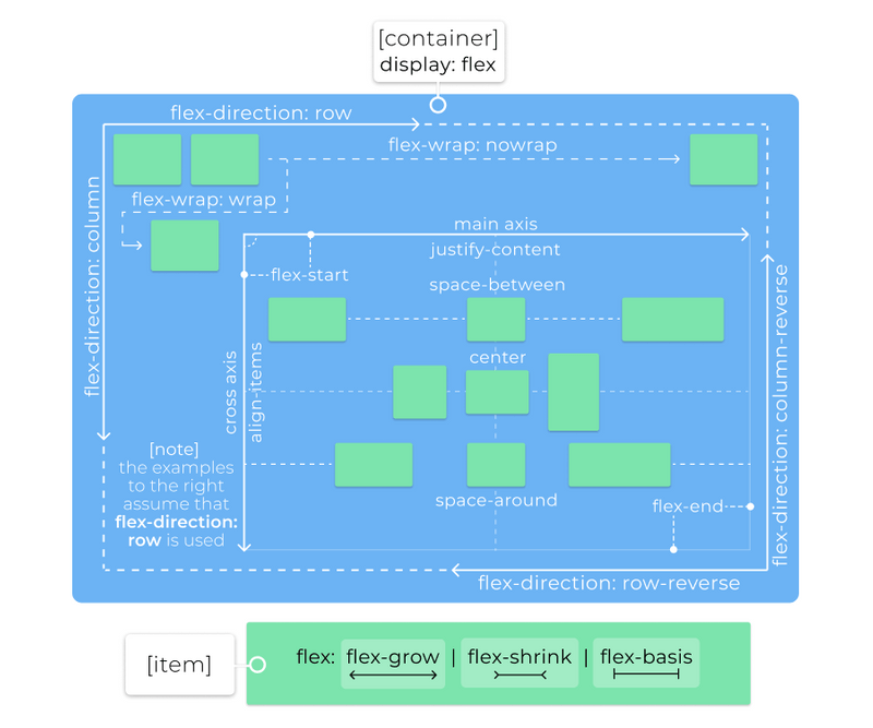
display: flexordisplay: inline-flex: creates a flex context (or an inline flex context) for direct children of this elementflex-directiondetermines the main and cross axis for the container, valid values are:row(default): horizontal, in the direction of writing (left to right for English)row-reverse: horizontal, in the opposite direction of writing (right to left for English)column: vertical, top to bottomcolumn-reverse: vertical, bottom to top
flex-wrapdetermines if flex items will try to fit in one line, valid values are:nowrap(default): all flex items will be on one linewrap: flex items will wrap onto multiple lines, top to bottomwrap-reverse: flex items will wrap onto multiple lines, bottom to top
flex-flow: shorthand combiningflex-directionandflex-wrap- Formal syntax:
flex-flow: <'flex-direction'> || <'flex-wrap'>
- Formal syntax:
justify-contentdefines the alignment along the main axis, valid values are:flex-start(default): pack flex items from the startflex-end: pack flex items from the endstart: pack items from the startend: pack items from the endleft: pack items from the leftright: pack items from the rightcenter: pack items around the centerspace-around: distribute items evenly with equal space around themspace-between: distribute items evenly with equal space between themspace-evenly: distribute items evenly, ensuring equal space between any two itemsstretch: distribute items evenly, stretching auto-sized items to fit the container
align-itemsdefines the alignment along the cross axis, valid values are:flex-start(default): pack flex items from the startflex-end: pack flex items from the endstart: pack items from the startend: pack items from the endcenter: pack items around the centerbaseline: align items based on their baselinesstretch: stretch items to fill the container
align-contentdefines the alignment of extra space along the cross axis, valid values are:flex-start(default): pack flex items from the startflex-end: pack flex items from the endstart: pack items from the startend: pack items from the endcenter: pack items around the centerspace-around: distribute items evenly with equal space around themspace-between: distribute items evenly with equal space between themspace-evenly: distribute items evenly, ensuring equal space between any two itemsstretch: distribute items evenly, stretching auto-sized items to fit the container
Items
flex-growdetermines how much the item can grow if necessary- Accepts a single positive number (unitless), default value is
0 - Specifies how much of the remaining space in the flex container should be assigned to the item
- The remaining space is the size of the flex container minus the size of all flex items' sizes together
- If all items have the same
flex-grow, all items will receive an equal share of the remaining space - If not all items have the same
flex-grow, the remaining space is distributed according to the ratio defined by these values
- Accepts a single positive number (unitless), default value is
flex-shrinkdetermines how much the items can shrink if necessary- Accepts a single positive number (unitless), default value is
1 - If the size of all flex items is larger than the flex container, items shrink to fit according to
flex-shrink
- Accepts a single positive number (unitless), default value is
flex-basisdetermines the initial size of a flex item before the remaining space is distributed- Can use any valid
widthvalue, intrinsic size values,auto(default) orcontent automeans "look at mywidthorheightproperty", whereascontentis used for automatic sizing
- Can use any valid
flex: shorthand combiningflex-grow,flex-shrinkandflex-basis- Formal syntax:
flex: none | [ <'flex-grow'> <'flex-shrink'>? || <'flex-basis'> ]
- Formal syntax:
align-selfallows the item to override the defaultalign-itemsspecified by the container- Valid values are the same as those of the
align-itemsproperty in the container
- Valid values are the same as those of the
orderdetermines the ordering of the item- Accepts an integer value
- Items in a container are sorted by ascending
ordervalue and then by their source code order - Might cause accessibility issues if used incorrectly
 Code Honchos